The 60/40 portfolio: historical analysis of a 500 euro/month PAC
Historical analysis of a 60/40 stock-bond portfolio: origins, results of a 500 euro/month PAC with annual rebalancing, benchmark comparison with the S&P 500, and risk metrics.
Saturday, 7 March 2026

The 60/40 portfolio is probably the most cited allocation strategy in modern finance: 60% in equities and 40% in bonds. Simple, intuitive, and for decades considered the ideal setup for investors seeking growth without excessive volatility.
But does it really work? In this article we analyze it with real data by simulating a 500 euro/month PAC (Dollar-Cost Averaging plan) with annual rebalancing over about 15 years of market history.
Origins: who was the 60/40 portfolio designed for?
The idea of a balanced 60/40 portfolio is rooted in Modern Portfolio Theory, developed by economist Harry Markowitz in 1952. Markowitz mathematically showed that diversification across low-correlation assets can reduce total risk without proportionally sacrificing return: the core principle behind the efficient frontier.
In later decades, with the rise of pension funds and large U.S. institutions, 60/40 became a de facto standard in wealth management. It was built for a medium-risk investor with a medium-to-long time horizon and a need to protect capital during downturns.
Equities (60%) provided the growth engine; bonds (40%) acted as a shock absorber in crisis phases, often moving differently from stock markets.
For decades, from the 1980s to the early 2000s, this strategy worked very well, also supported by a long declining-rate cycle. Then 2022 raised an uncomfortable question: what happens when stocks and bonds fall together? The data gives a nuanced answer.
The simulation: 500 euro/month PAC, annual rebalancing
For this analysis we built a 60/40 portfolio on Wallible using ETFs that replicate global equity indices (60%) and bond indices (40%), with a 500 euro monthly PAC and annual rebalancing. The period covers roughly 15 years, from mid-2010 to 2026.
Annual rebalancing is a deliberate choice: every year, portfolio weights are brought back to target by selling the asset that has grown more and buying the one that has lagged. This mechanical discipline is one of the key differences between a structured process and improvisation.
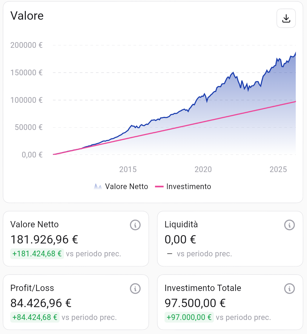 Net value evolution vs cumulative investment (PAC 500 euro/month, mid-2010 to 2026). Source: Wallible.
On a total contributed capital of 97,500 euro, the portfolio reached a net value of 181,927 euro, generating a profit/loss of about 84,427 euro. In other words, each invested euro became almost two euros.
Return over time
Looking at absolute return is important, but to evaluate investment quality we need compounded and annualized metrics.
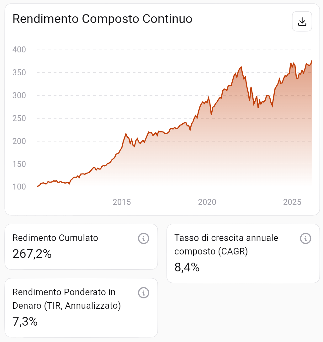 Continuous Compounded Return. Source: Wallible.
The chart shows steady growth with some significant interruptions, especially around 2022, when high inflation hit both equities and bonds at the same time.
| Metric | Value |
|---|---|
| Cumulative Return | +267.2% |
| CAGR (compound annual growth) | 8.4% |
| Annualized IRR (cash-flow weighted) | 7.3% |
A CAGR of 8.4% over roughly 15 years is a solid result for a moderate portfolio. The 7.3% IRR, which accounts for the actual timing of monthly contributions, is the most realistic return measure for a gradual investor.
Efficiency: Sharpe and Sortino Ratio
Knowing how much a portfolio returned is not enough; we also need to understand how much risk was taken to get that return.
- Sharpe Ratio: excess return over the risk-free rate divided by total volatility.
- Sortino Ratio: similar to Sharpe, but penalizes only downside volatility (losses). A value above 1 is generally considered good.
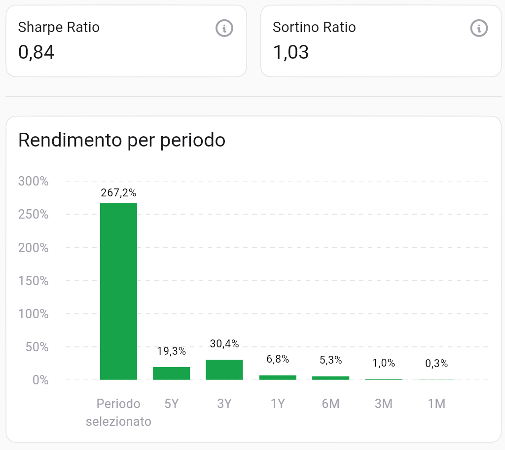 Efficiency and return by period. Source: Wallible.
The portfolio shows a Sharpe Ratio of 0.84 and a Sortino Ratio of 1.03. A Sortino above 1 suggests that downside risk was managed well relative to returns. Performance in the last 3 years (+30.4%) also highlights a solid recovery after the difficult 2022 phase.
Drawdown: how much did it lose in the worst moments?
Drawdown measures the maximum loss from peak to trough. It is the statistic that most directly reflects the emotional experience during crises.
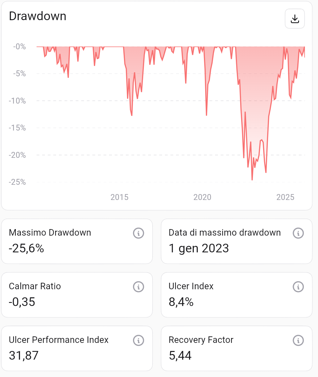 Historical drawdown and risk factors. Source: Wallible.
The maximum drawdown was -25.6%, reached on January 1, 2023 during the 2022 crisis. The Recovery Factor of 5.44 indicates that the portfolio gained 5.44 times its maximum loss, a sign of good long-term recovery capacity.
Correlation between equities and bonds
One of the theoretical pillars of 60/40 is low correlation between the two asset classes: when equities fall, bonds tend to hold up, and vice versa.
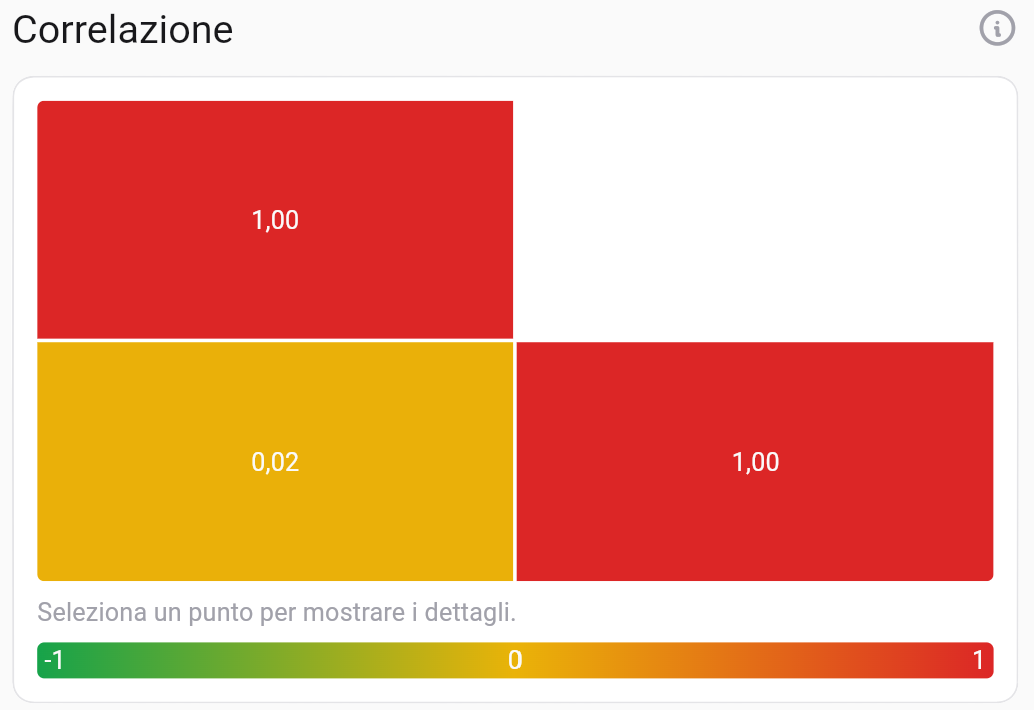 Correlation matrix. Source: Wallible.
The equity-bond correlation over the full period is 0.02: essentially zero. This confirms the diversification rationale, reducing total volatility versus an all-equity portfolio. In 2022 correlation temporarily moved in the wrong direction, but over the full horizon the diversification benefit still held.
Expected performance and efficient frontier
Where does this portfolio sit relative to the market opportunity set? The efficient frontier shows portfolios with the highest expected return for each level of risk.
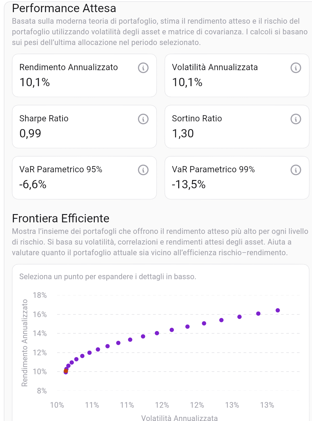 Expected performance and positioning on the efficient frontier. Source: Wallible.
The 60/40 portfolio is placed in the minimum-variance area of the efficient frontier, with:
| Metric | Value |
|---|---|
| Expected Annualized Return | 10.1% |
| Annualized Volatility | 10.1% |
| Expected Sharpe Ratio | 0.99 |
| Parametric VaR 95% | -6.6% |
| Parametric VaR 99% | -13.5% |
A 95% VaR of -6.6% means that in the worst 1 out of 20 years, expected annual loss should not exceed 6.6%. These numbers confirm the portfolio’s moderate profile.
Benchmark comparison: 60/40 vs S&P 500
The most common question: would it have been better to invest everything in equities?
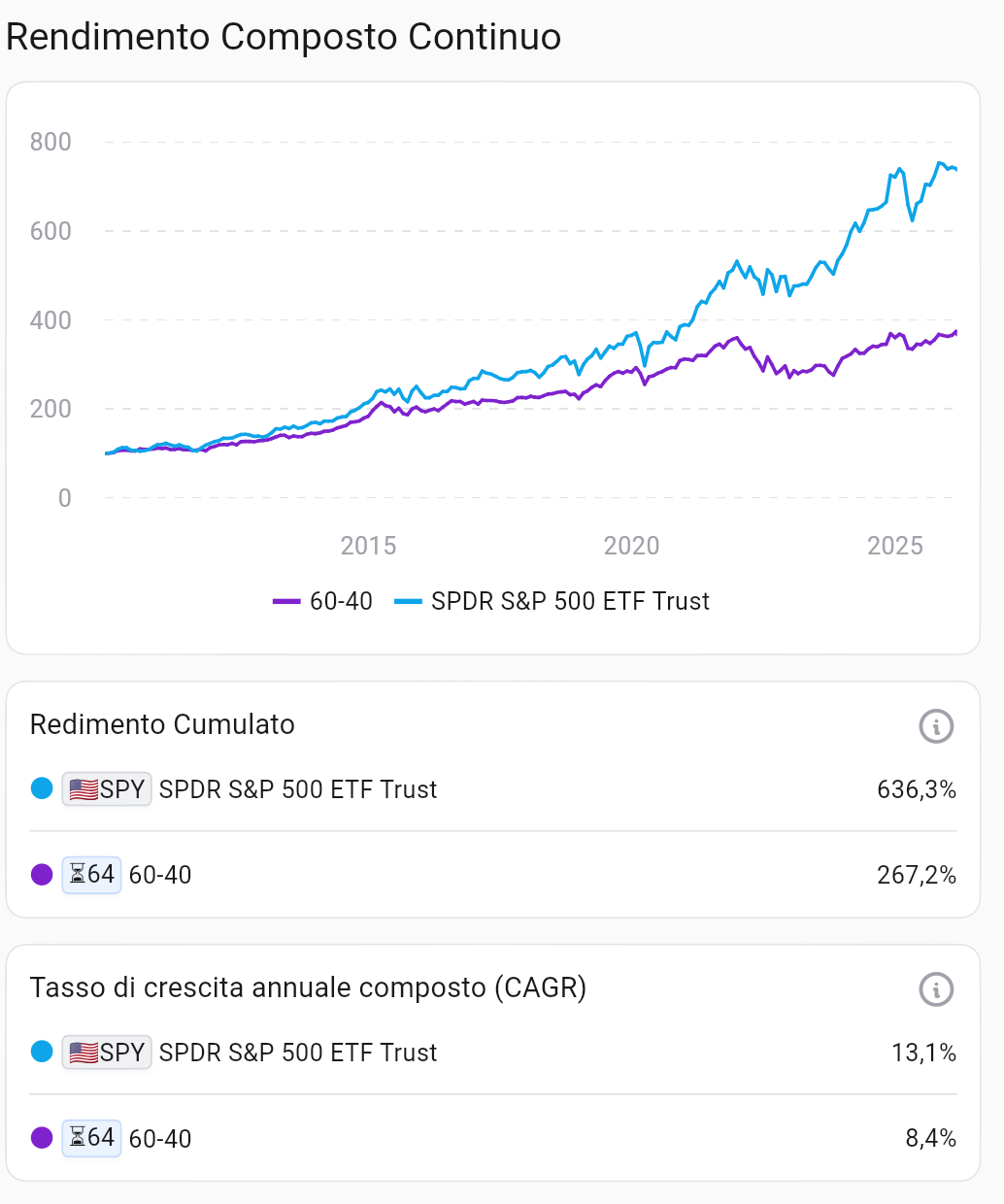 Comparison with SPDR S&P 500 ETF Trust (SPY). Source: Wallible.
| CAGR | Cumulative Return | |
|---|---|---|
| S&P 500 (SPY) | 13.1% | 636.3% |
| 60/40 Portfolio | 8.4% | 267.2% |
The S&P 500 outperformed 60/40 in this period: nearly 2.5 times more in cumulative return. But this comparison must be read carefully: the S&P 500 is a pure-equity index with significantly deeper drawdowns (about -34% in 2022 vs -25.6% for 60/40).
The choice depends on risk tolerance and, often underestimated, the ability to emotionally withstand losses without selling at the worst time.
Conclusions: does 60/40 still make sense in 2026?
Over about 15 years, the 60/40 portfolio nearly doubled invested capital, with 8.4% CAGR, contained drawdown, and solid risk-adjusted efficiency. It is not the highest-return portfolio, but it remains a robust strategy for investors who want balance between growth and protection.
The real strength of this approach is not the formula itself, but the discipline it enforces: invest regularly, rebalance methodically, and avoid being driven by short-term volatility. Over time, those behaviors make the difference.
To apply these principles in practice, you can use the Wallible portfolio simulator and monitor allocation, performance, and risk in one place.
Free workshop on Portfolio Management
Wallible is evaluating the organization of a free workshop dedicated to Portfolio Management. You can register your interest by filling out this short form: Sign up for the workshop
Related guides
Free ETF Portfolio Simulator: practical guide
How to use a free ETF portfolio simulator to test a strategy, compare benchmarks, and move to execution with Wallible.
Average S&P 500 return over the last 20 years: how to read it with a PAC simulation
How to interpret the average S&P 500 return over the last 20 years, avoid common pitfalls, and use a PAC simulation for …
DCA (Dollar Cost Averaging) on S&P 500 over the past 20 years
Dollar Cost Averaging (DCA) is a popular investment strategy that involves investing a fixed amount of money at regular …