Efficient Frontier
Find out how to read Wallible's efficient frontier, compare your portfolio with the Pareto front and ask for a rebalancing towards the optimal point you prefer.
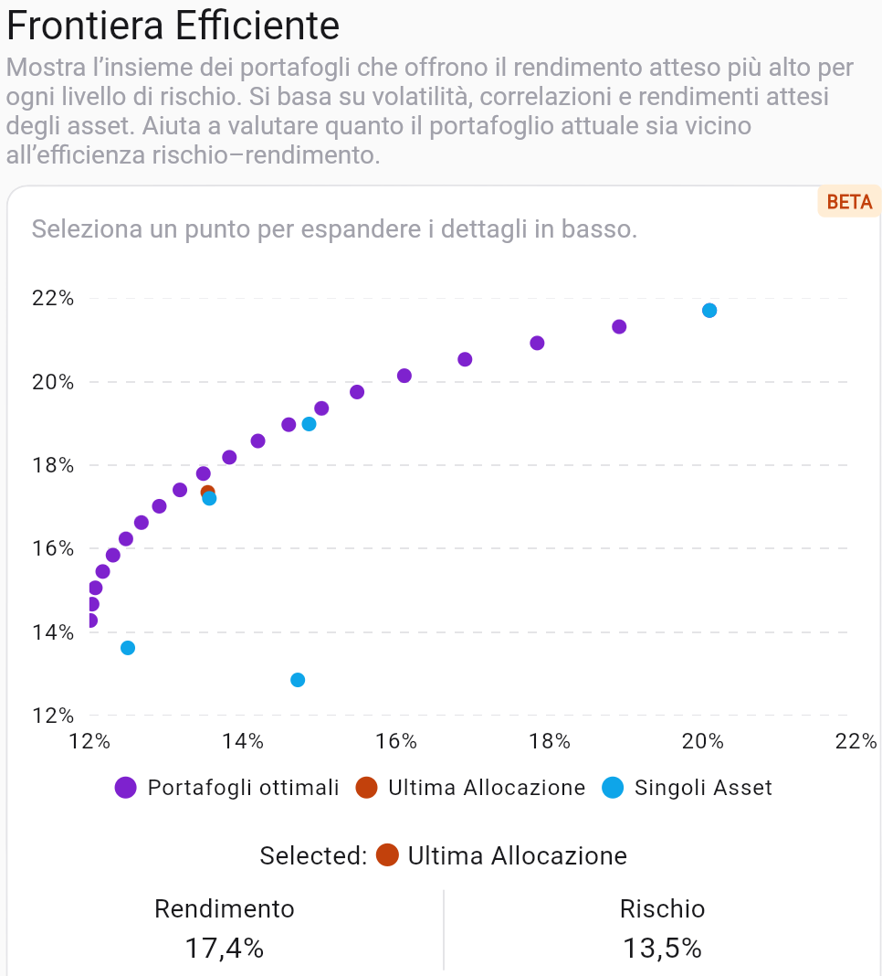
What is the efficient frontier
The efficient frontier is the curve that unites the portfolios with the highest expected return at equal risk. In Wallible we build it by combining:
- volatility, expected returns and correlations of assets in your portfolio;
- combinations of weights that respect the operational constraints (e.g. non-negative weights, sum to 100%);
- the points that maximize the risk-return efficiency (Pareto front).
The goal is to let you see how close or far your current portfolio is from optimal portfolios and how much individual assets contribute to risk and return.
How to read the graph
- X-axis = Risk (volatility), Y-axis = Expected return.
- Optimal Portfolios (Purple Dots): Each point is a mix of assets that maximizes return for a given level of risk.
- Last allocation (orange dot): Your portfolio position today; it tells you how far you are from the Pareto front.
- Individual assets (blue dots): risk and expected return of each instrument; they help understand which securities drive or slow down efficiency.
- Interactive selection: by clicking on a point you see the risk and return values of the selected portfolio and compare them with yours.
Quick comparison with the Pareto front
- If your last allocation is below or to the right of the frontier, you are taking on more risk for the same return (or less return for the same risk) than an optimal portfolio.
- If the orange dot is close to the curve, the portfolio is already efficient for the chosen risk level.
- Look at the position of the individual assets: those very to the right or very high highlight securities that increase risk or return markedly; assets close to the origin indicate limited contribution to both.
Pick a point and ask for rebalancing
- Select the point on the frontier that corresponds to the desired profile (more return for the same risk, or less risk by accepting a lower return).
- Read the expected return and risk values shown below the graph for the chosen point.
- Press the rebalance action to ask the platform to propose optimal weights consistent with that point. Wallible will calculate the transactions to make to get you towards that optimal allocation while respecting your portfolio constraints.
Practical examples
- Align with the frontier: If your point is below the curve, choose the closest point on the frontier and ask for rebalancing to get more return at the same current risk.
- Reduce risk: Select a point further to the left of your allocation; the platform will suggest weights that decrease volatility by sacrificing a portion of the expected return.
- Managing a Dominant Asset: If a single stock appears far to the right, try a lower-risk point on the frontier to balance that contribution; rebalancing will tend to reduce its weight.
- Seek maximum return: aim for the high tops of the curve knowing that the risk grows; useful if you have a long horizon and high tolerance to oscillations.
Usage tips
- Periodically compare the latest allocation with the curve to check whether it derives from conscious choices or market movements.
- Use the individual asset chart to understand which stocks steepen the frontier and which flatten it.
- Before rebalancing, evaluate transaction costs, taxation and operational limits: the frontier is theoretical, but the operations are real.
Do you want to try all the tools for analyzing expected performance? Get your free trial.
PlansDisclaimer
This article is not financial advice but an example based on studies, research and analysis conducted by our team.