Efficient Frontier
Learn how to read Wallible’s efficient frontier, compare your portfolio with the Pareto front, and request a rebalance toward the optimal point you prefer.
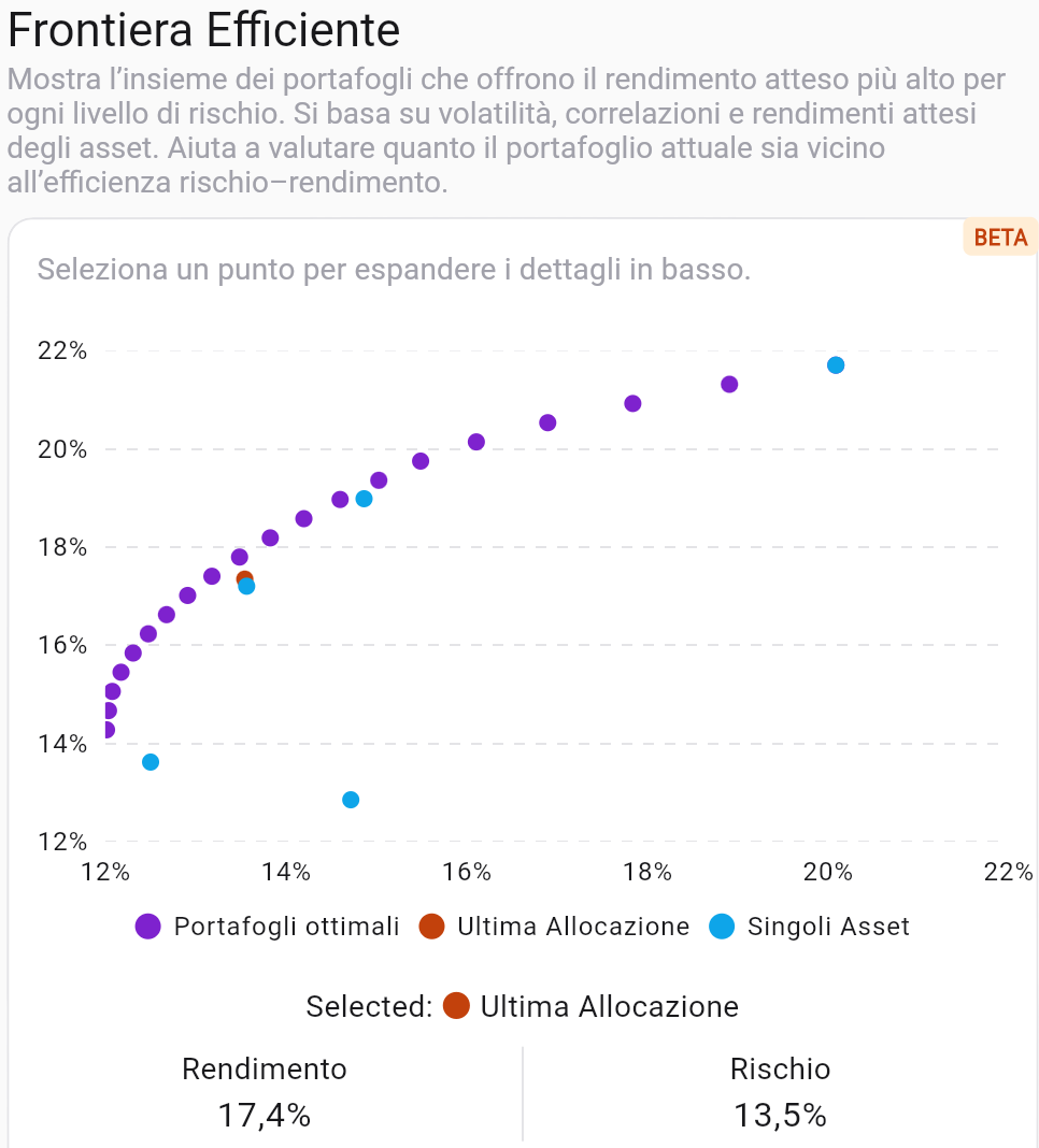
What is the efficient frontier
The efficient frontier is the curve that connects the portfolios with the highest expected return for a given level of risk. At Wallible we build it by combining:
- volatility, expected returns, and correlations of the assets in your portfolio;
- weight combinations that respect operating constraints (e.g., non‑negative weights, sum to 100%);
- the points that maximize risk–return efficiency (Pareto front).
The goal is to show how close your current portfolio is to the optimal ones and how each asset contributes to risk and return.
How to read the chart
- X axis = Risk (volatility), Y axis = Expected return.
- Optimal portfolios (purple dots): each dot is a mix of assets that maximizes return for a given risk level.
- Latest allocation (orange dot): where your portfolio sits today; it shows how far you are from the Pareto front.
- Individual assets (blue dots): each instrument’s risk and expected return; helps spot which titles push or drag efficiency.
- Interactive selection: click a dot to see its risk and return and compare them to yours.
Quick comparison with the Pareto front
- If the latest allocation is below or to the right of the frontier, you are taking more risk for the same return (or less return for the same risk) than an optimal portfolio.
- If the orange dot is close to the curve, the portfolio is already efficient for the chosen risk level.
- Look at the individual assets: far‑right or high dots highlight titles that increase risk or return noticeably; dots near the origin contribute little to either.
Pick a point and request the rebalance
- Pick the frontier point that matches your target profile (more return at the same risk, or less risk accepting a lower return).
- Read the expected return and risk shown under the chart for the selected point.
- Hit rebalance to ask the platform to suggest optimal weights for that point. Wallible will calculate the transactions to move you toward that optimal allocation while respecting your portfolio constraints.
Practical examples
- Align to the frontier: if your dot is below the curve, choose the nearest point on the frontier and request a rebalance to get more return at the same risk.
- Reduce risk: select a point to the left of your allocation; the platform will suggest weights that lower volatility while sacrificing some expected return.
- Tame a dominant asset: if a single title sits far to the right, pick a frontier point with lower risk to balance its impact; the rebalance will tend to reduce its weight.
- Seek maximum return: aim for the high end of the curve knowing risk rises; useful if you have a long horizon and high tolerance for swings.
Usage tips
- Periodically compare your latest allocation to the curve to see whether it reflects conscious choices or market drift.
- Use the individual assets view to spot which titles steepen the frontier and which flatten it.
- Before rebalancing, factor in transaction costs, taxes, and operational limits: the frontier is theoretical, but trades are real.
Discover how easy it is to replicate this analysis and many other investment strategies in the Wallible app. With free registration you get access to all the tools.
Sign up for freeDisclaimer
This article is not financial advice but an example based on studies, research and analysis conducted by our team.